"Feedback" Redesign
Platform: Mobile App, iQIYI
Operation system: iOS, Android
Duration: 3 months, 2016.11~2017.01
My Role: Product designer
Related Department: Customer Service Department
Key words: Demand definition,Cross-department cooperation

BACKGROUND
Introduction
iQIYI is currently one of the largest online video companies in the world, offering TV dramas, movies, variety shows, animation, and other quality contents. Nearly 6 billion hours spent on its service each month and over 500 million monthly active users. Most of users stay on the Mobile App. In the App, "Feedback" and "Online Service" is used as the bright of the customer service and the user. As increasingly users and complexity of the function structure in App, "Feedback" plays a more important role to guarantee the performance of this App.
Feedback
Users can report problems during they are using the APP and developers fix these bugs according to users' reports
Online Service
It is a traditional way for users to report their problems. They call the online customer-services directly, which needs enough staff to answer customers' questions in real-time.

My role
I was the product designer and responsible for this project---update of "Feedback".
-
User research, the object includes: end-users, customer-services, developers
-
Collect and coordinate the demand from different departments
-
Output Wireframe and low-fi prototype
-
Design the logic flow of data
-
Decide the copywriters of UI
-
Output the Hi-fi prototype and Product Requirement Document(PRD)
-
Explain PRD to developers, testers and UI designers; Track the process of development
-
Monitor the performance after it was launched
PROBLEM STATEMENT
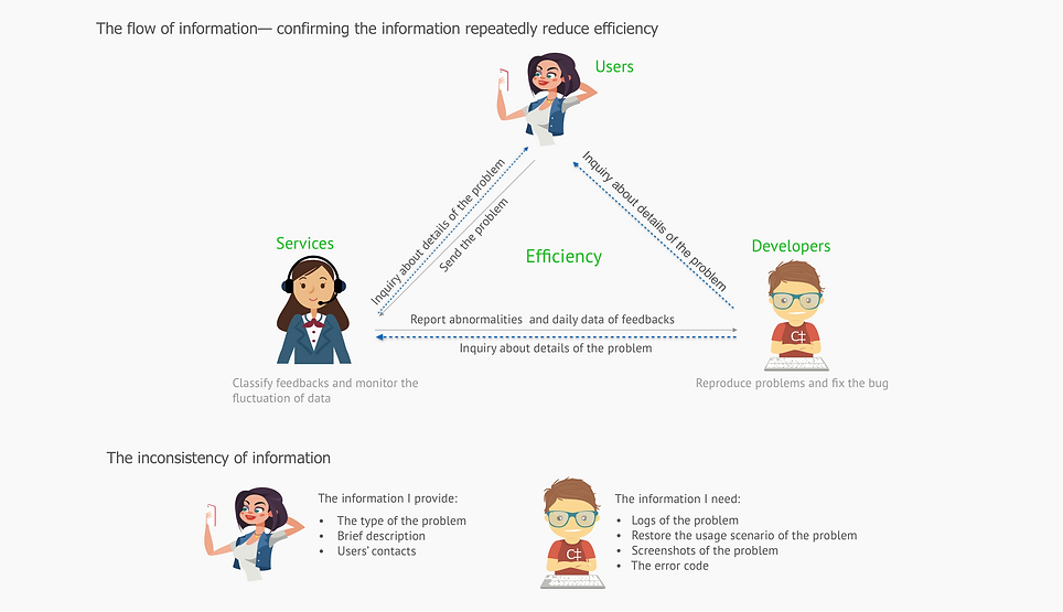
To iQIYI, this page has long been used for 3 years without update, obsolete classification and poor designs lead three problems:

Why people will have the complaint?
USER RESEARCH
As this function related to three groups of people, we interviewed them respectively. For users, we gave out 18 questionnaires and talked to two users among them. Then we interviewed two customers and 3 developers, who regularly dealt with the problems from feedback.

Data Analysis

The click of “Online service” is five times of “Feedback”
-
The location of “Online service” in this page is obvious and easy to reach;
-
People like to contract human once they encounter problems

Feedbacks focus on several hot business units or functions
-
Different users could report same problems repetitively
COMPETITIVE ANALYSIS
We choose the APPs rank second and third in the market of online videos in China, and WeChat with the most exhausted design of “Feedback”in the whole market. Also, we choose youtube as a reference.

Findings
Tencent, Youku: the designs are similar to iQIYI’s
Youtube: providing logs and screenshots to developers, while users need to input the description
WeChat:
-
The design is exhausted. It provides diversity possible scenarios for people to choose.
-
The excessively deep hierarchy is not so suitable for the scenario, making people read a lot of information before choosing the right options
IDEATION
Design Principles

The “Feedback” will include five informational elements, which serve for developers to troubleshoot problems: the type of problems, the description of problems, the contact of users, screenshots and the log of problems.
At the same time, in this page, we adjusted the location of “Feedback” and “Online service” in different scenarios.
In order to reduce the input and number of clicks, we think out two schemes.
Guerrilla Usability Test


I conducted four tests with users. Three of them chose the second framework, the below is main gains I achieve from them
-
Users don’t like to input the information---They usually make choices rather than directly input into the phone , especially when they are fretful to complain about their problems.
-
Users hope to see the answer---People hope see a ready solution rather than report the problem on this page
-
The location and size of one area decide people’s impression about the whole page---People easily focus on the large size area and the upper part of a page. Therefore, the first scheme makes users get frustrated more easily since they notice the input area at first sight, albeit the information users need to provide is the same in two schemes.
-
The online service should solve the problem at once, but they usually face the problem we cannot answer immediately
COPYWRITER
According to the data analysis, we got that the feedback can be divided by different business units(user account, VIP) and functions( the player, video download).
Therefore, I collected the typical feedback classification and description from different product designers who are in charge of these related modules. As the number of questions is so big and the description should be read by users customer-services and developers, the following is the writing rules when I design the copywriter:
-
the sentence should be brief since the space is limited
-
the words should be precise, because it can help developer locate bugs quickly
-
the copywriter should be easily understand by everyone, avoiding use terminologies or complicated sentence structure
HI-FI PROTOTYPE

OUTCOMES
After the new page was launched, we selected the relative data to check the design effect. The result as following :

(10/14-10/27) vs (11/03-11/16)
• The PV/DAU increased 28.68%
• Rejection rate of the invalid feedback(the feedback without available information) reduce 35%
• Developers saved average one day to solve one problem
Conclusion:
-
Increasing users begin to use "Feedback"
-
The report from users more useful than before
-
Speed up developers resolve bugs